Client: Your Care Partner
Our Role: Creative Agency
In 2015, Sentiero Group engaged One Small Step to help build a new brand in the in-home care sector. They were creating a service that would make it easier for elderly and disabled people to access the best in-home care by aggregating all available services in one place. We would develop the brand from the ground up, including naming, visual branding, communications and a website.
But before any of this happened, we needed to gain deeper understanding of the sector. Coming from an education background, the care sector was new to Sentiero Group. The research needed to provide insights that would drive and inform the business model and communications.
We held a series of in-home interviews with elderly people who were accessing care, and focus group sessions with the children of people receiving or in need of in-home care. The questionnaire was designed to ascertain how people accessed care, what some of the challenges were, and what people wanted from their care services.
These conversations were often very personal and incredibly touching. It became clear that people simply didn’t know what care options were available to them. In-home care was rarely planned for, instead it was accessed when an incident or illness made it necessary, and even then, the care that was available was inflexible and impersonal.
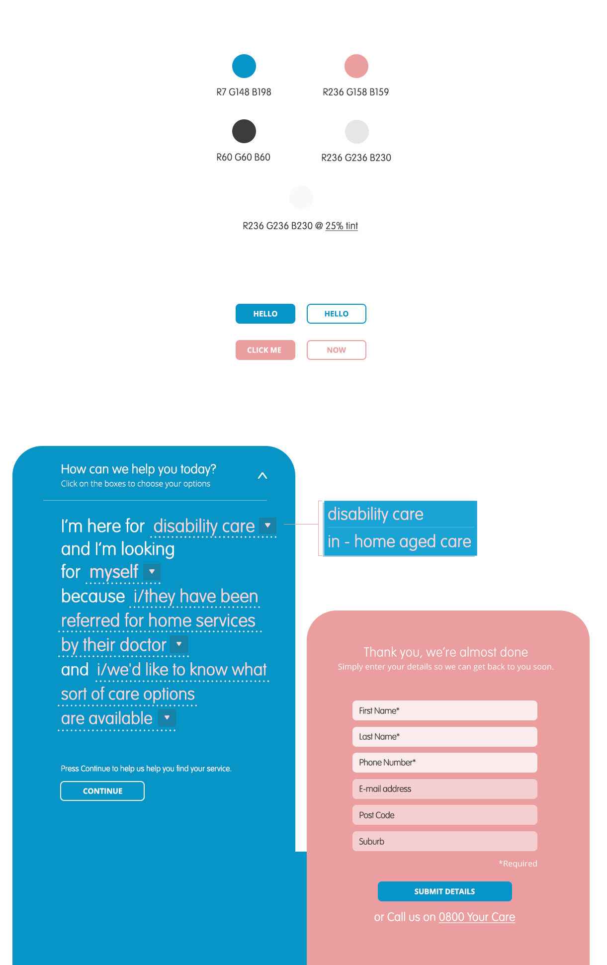
We were also able to gain an understanding of how people thought a care provider should communicate. The term ‘care package’ felt impersonal, while ‘tailored care solution’ communicated that the organisation provided personalised support. The research gave Sentiero Group a solid foundation to inform a customer-centric business model, as well as a connected brand and communications.
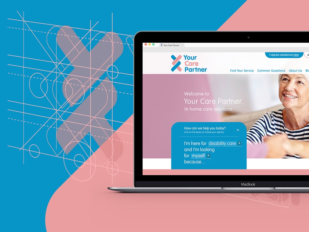
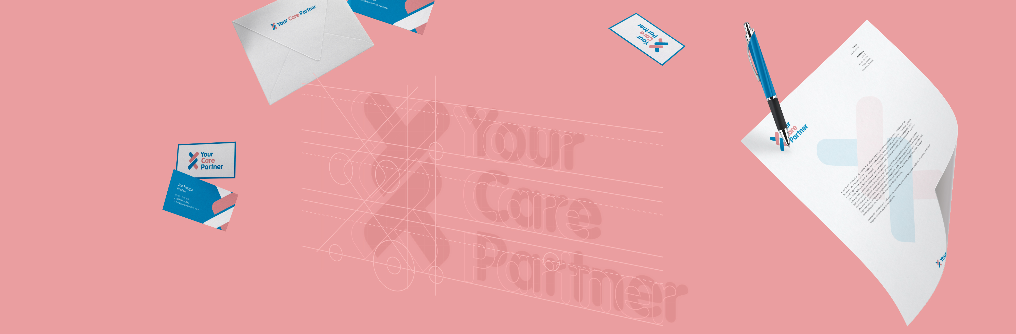
Later in the project, we drew on the research to inform the creation of the brand. A common theme throughout the research was the fear that accessing in-home care would take away people’s independence. People wanted flexible care, that would work in with their lifestyle, not the other way around. With this knowledge we developed the name, Your Care Partner. It was the perfect fit to represent the organisation’s vision to provide collaborative, flexible support.
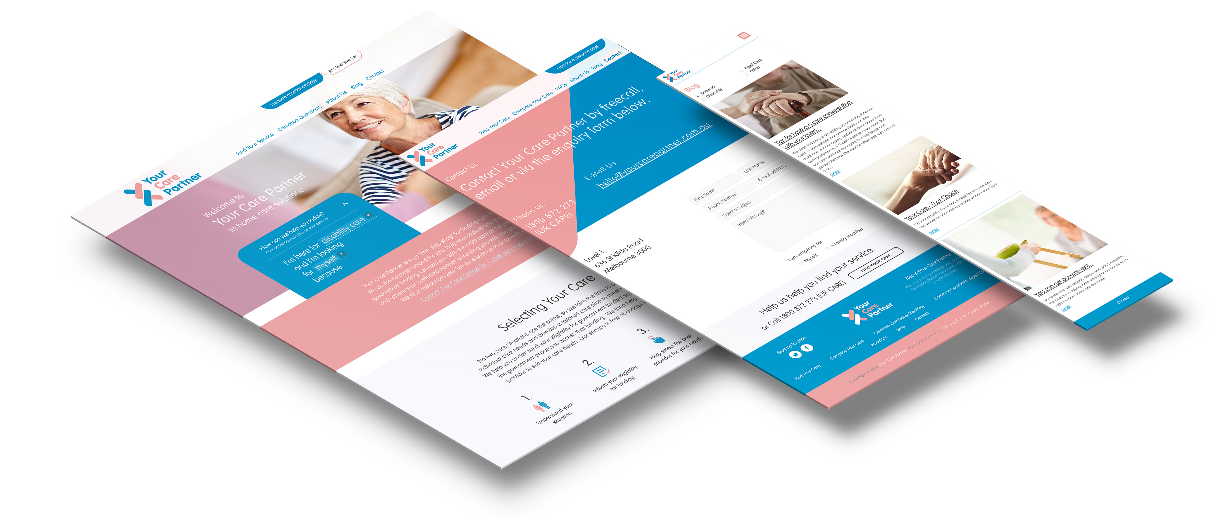
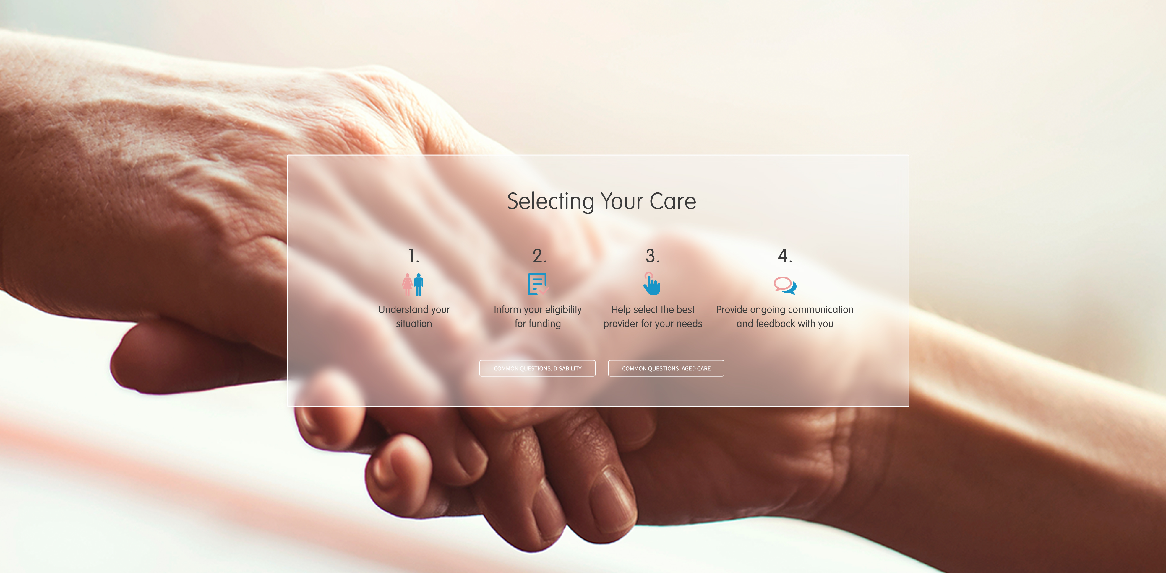
The logo and branding followed. Inspired by interlocking arms and the double helix, we designed a logo to represent partnership, support and health, We then fleshed out the brand guidelines and brought it to life in the digital space, developing an interactive website from scratch. The research also informed the tone and messaging of digital, social and print advertising.