2020 Rebranding Trends
Oscar Puentes
The automotive industry doesn’t change on a whim as the cost of replacing badges and collateral can be extreme.
There could be many reasons why businesses need to evolve visually. It is not an easy decision, but sometimes necessary when the face of the company is not communicating or reflecting its values, getting old-fashion or need to adapt to new formats.
There is a huge influence of the design trends each time brands are created. So they are reflective of the times but after a while they reflect older times. When the system, colours, weight, typography and in general the look and feel of the brand is getting old and losing engagement with audiences, it is time for an update.
In 2020 a year like no other, good for some the worst for others, some brands decided to boost their brand marks by going back to the basics, iconic shapes and flat colours. The automotive industry doesn’t change on a whim as the cost of replacing badges and collateral can be extreme. This round of changes was led by Volkswagen in late 2019 followed by BMW, Toyota and Nissan in 2020 getting rid of the ‘3D design’, well used for many years.
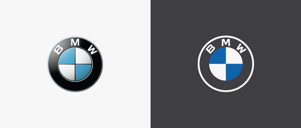
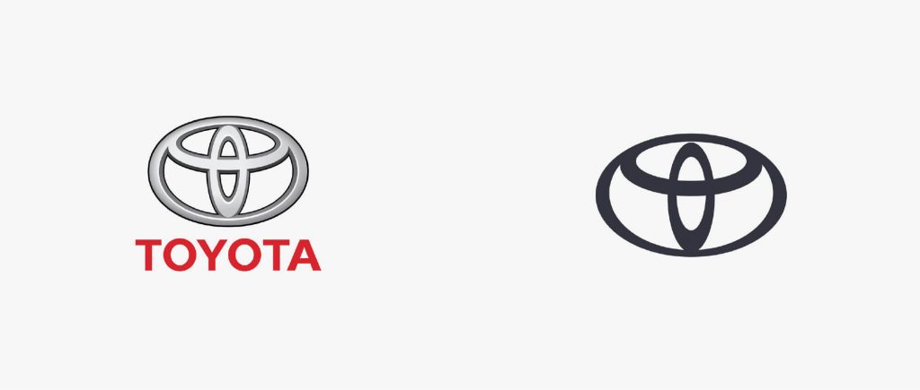
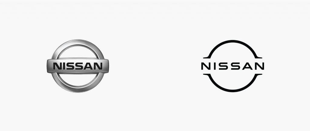
One of the big motivating factors of the change is the big step into the digital world. Trying to look less like a car badge and thinking more about being more adaptable and usable in digital media from a 16×16 px icon to an 8k screen.
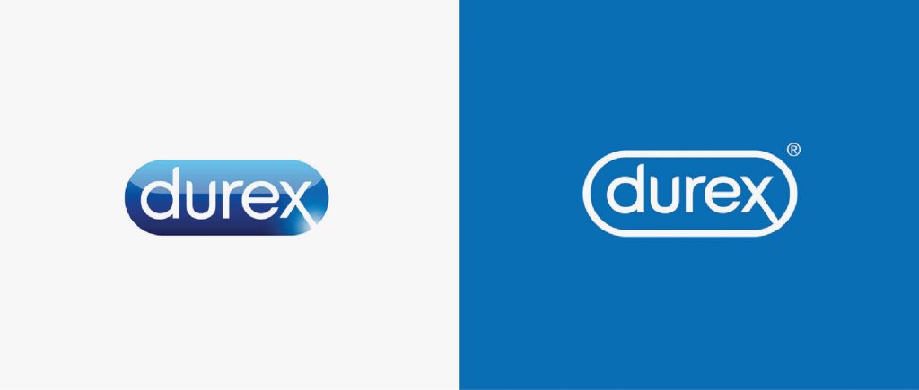
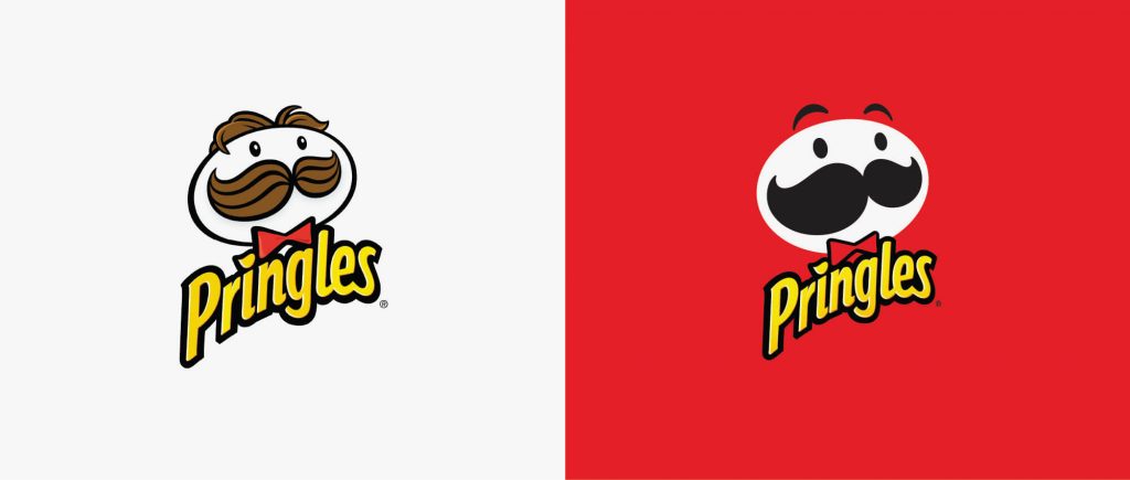
Durex also felt it was time for a facelift, with the previous logo reminding me of the buttons of websites in 90’s early 2000’s. Pringles made a huge step for the first time after 20 years changing its iconic Mr Pringle, going to the extreme of synthesizing and perhaps losing a bit of strength in its character.
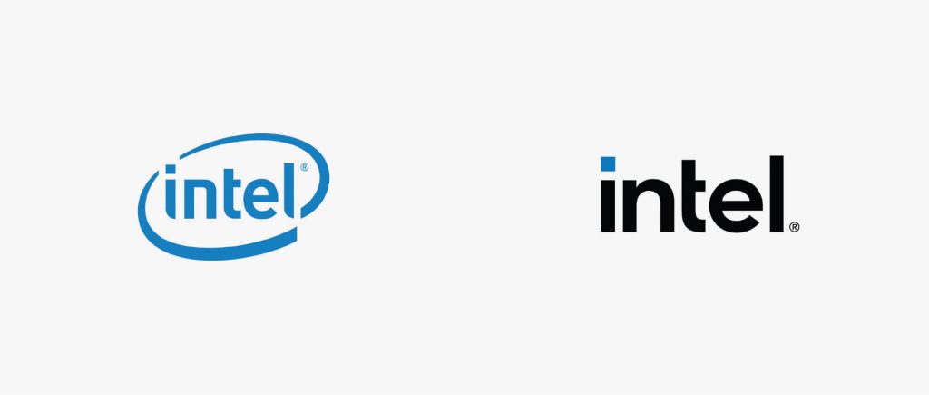
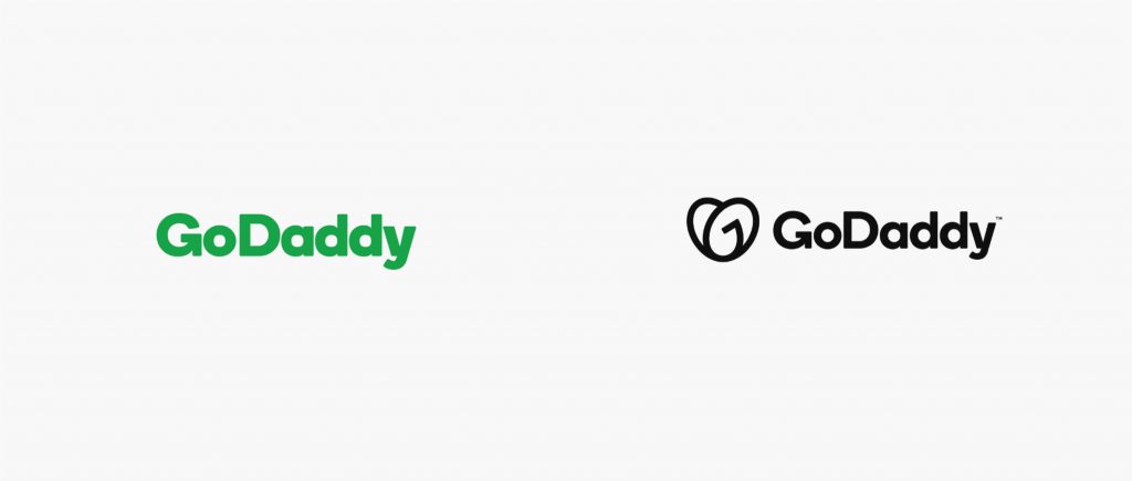
Intel, Tripadvisor and GoDaddy also simplified and strengthen their logotypes with a clear influence of the AvantGarde font, in the Intel case there’s also a big example of synthesis that makes us wonder, how far should we go simplifying a brand without losing the spark?

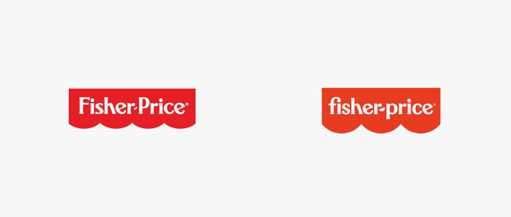
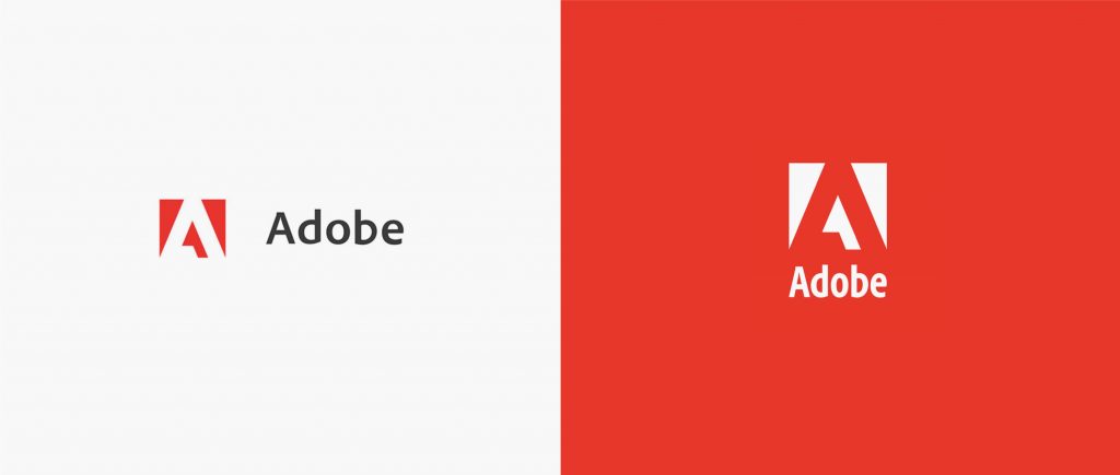
Fisher-Price was more subtle, refining the logo, adjusting spaces, changing the awning from 4 to 3 semicircles and going from upper F and P to lowercase which makes it more friendly, a smart move without compromise the iconic logo. Adobe cleaned up their brand and in their own words ‘refreshing the specific colour red to be warmer and more contemporary’ with the focus on the mark, very similar to their logo in 1993 but monotone. Also, making the mark one element would have made it a lot easier to use.
Google Maps redesigned the app and the logo embedding the actual map within the ‘pin’ using google colours, making it more iconic and recognizable. And this lead to the change in all of the Google Workspace icons. Our feeling is that in their attempt to unify them and bring them in-line with the brand they end up trying to force the brand into the icons and making them difficult to differentiate with the number of colours shapes making them look identical.
Bing changed their name to Microsoft Bing and maybe in response to Google, went from flat colour to the use of bright/saturated colours probably following the trend of gradients on apps and digital companies, something to note is that they do not use the updated logo on the bing.com page instead features the Microsoft logo.
From what we’ve been able to see, re-branding in 2020 has clear brief- assure legibility at all sizes and across all surfaces in a dominating digital world, which means minimalist, iconic, monotone and flat designs. Kill any type of highlights and shadows as it’s hard to reproduce and it now looks old fashioned. Probably one of the best examples is the last one here for Burger King, get back to iconic basics and don’t leave people wondering who you are. Simple, graphic, iconic. Is yesterday the new future?